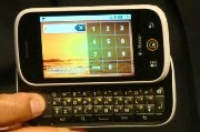
Motorola's Cliq has a number of innovative and cool features, but ultimately lacks the chemistry to capture any significant portion of the smartphone market or return lost industry relevance to Motorola.
Motorola has had a rough year with sluggish sales and plummeting revenue. The announcement of the Google Android-based Cliq, and Motorola's MotoBlur interface have generated some buzz, but the Cliq appeals to the wrong market.
To be fair, I think the contact integration feature is awesome. The ability to click on social networks to include for a contact and let the Cliq automatically track and update that information even as your contacts make changes to��heir social networking accounts is an innovation that will likely be adopted by other vendors.
Providing the ability to erase the data on the phone using remote wipe is also a welcome move. Mobile devices in general, and smart phones in particular, contain a lot of (sensitive) information and they are easily lost or stolen. There is a remote wipe app available for iPhone for a fee, but Motorola appears to be offering the service for free. Again, this is a feature that other vendors should pick up on in my opinion.
That said, the Cliq is a juvenile device. Motorola seems to have focused its attention on software feature innovation while completely ignoring the aesthetics and style of the hardware it is putting the features in. There are less functional hardware designs out there to be sure, but the slide-out QWERTY keyboard, rectangular micro-laptop with a 3-inch screen is uncompelling at best.
As far as mobile device hardware is concerned, that is not a deal-breaker per se. It would be nice to see some more creative hardware innovation, but I understand that there is only so much you can do with a device that is the size of a 3" x 5-inch index card when most of the real estate is occupied by the screen out of necessity. But, the Cliq is more on par with devices aimed at tweens and less with more grown up devices like the Blackberries, the HTC Touch 2, or even the iPhone.
The primary feature setting the Cliq apart from competing devices is that it is the first (and thus far only) device with the MotoBlur interface. Conceptually, MotoBlur sounds phenomenal. In the real world though there are some kinks to work out.
Integrating information from various messaging and social networking sources into a single interface is a great idea, but it is hard to pull off on a 3-inch screen. The MotoBlur concept would probably make a great application or browser plugin for desktops and laptops, or even notebooks, but it's a lot of information to fit onto such a small display.
Screen size aside, MotoBlur also suffers from being version 1.0. The information overload combined with the inability to filter out information you don't want to see illustrate that there is room for improving the MotoBlur experience. I would expect the functionality and customizability of the MotoBlur UI to improve with future releases.
The Cliq will be a relative success for Motorola, but that isn't saying much given that Motorola hasn't had a genuine hit since the Razr debuted in 2004. And like its predecessors, the Cliq's teeny-bopper SMS-esque name is probably indicative of the audience that will embrace it most.
Motorola seems to be heading in the right direction with this handset, though. The Cliq is Motorola's first attempt at a Google Android-based device, and the first device to include the new MotoBlur UI. With luck, Motorola will gather user feedback and learn from the Cliq, but the Cliq itself unlikely to click with the grown-ups who actually buy smartphones.
by Tony Bradley, PC World

No comments:
Post a Comment